

become an A+ marketer, no studying required
or, how to spend a couple of hours to get maximum return on Amazon A+ content

In the last newsletter, I ran through the full-funnel marketing primer… the map of the channels you should know about and why each one matters. I also promised deep-dives on the meatiest ones, and I keep my word. So, this week, I want to welcome you to the wild world of Amazon A+ Content.

I’m doing this one first for a few reasons. First off, a number of you asked for it and I can be very easily persuaded. No seriously, ask even a little nicely. But, in truth, of all the channels I named, A+ Content has the best return on your time investment: roughly two hours of work1, zero dollars2, and a measurable bump in your conversion rate that compounds every day your book stays on Amazon. Amazon's own published guidance says A+ Content can lift sales by up to 10%, with most sellers seeing somewhere in the 3-10% range. For a book doing modest numbers, that math matters over a year and for a book doing strong numbers, it’s a no-brainer.
No matter how you’re publishing, this is a tool you should be employing 10000% of the time. Trad-pub authors often don’t know they can (or they assume the publisher did, when they may not have). Indie authors are often overwhelmed by everything ELSE that goes into releasing and promoting a book that this often gets forgotten. The “From the Publisher” section on most author detail pages is just... blank. Empty real estate that Amazon will fill with your own stuff, for free, if you just ask.
Now before we dive in: I know that this is only for Amazon and relates to KDP especially. But whether you’ve gone wide or not, this is a tool that I urge you to use. It’s independent of Kindle Unlimited, so don’t think that just because you’re not there, you’re boxed out of this. This is a “you can sit with us” situation.

what A+ content is, in basic terms
If you scroll down on any well-marketed book’s Amazon page, somewhere below the description and “Customers also bought” row, you’ll see a section called From the Publisher. That section contains banner images, character graphics, series information, “about the author” panels - basically, content that looks designed instead of just typed out.
That’s A+ Content. Amazon lets you build it using a set of pre-formatted blocks called modules. You drop in your images and copy, Amazon assembles it, and it shows up on your product page within about a week of submission.
Three things to know upfront:
It’s completely free - no KDP Select required, no Brand Registry, no Author Central paid tier. If you have a book published on Amazon, you have full access today.
You can apply one A+ Content “project” to multiple ASINs3. Build it once and then apply it to your hardcover, paperback, AND ebook listings BUT you do have to publish it separately in each Amazon marketplace (US, UK, CA, AU).
It gets reviewed before it goes live. Amazon checks your submission against their guidelines before publishing it (we’ll get into those shortly). Most rejections are for the same handful of small mistakes, which I’ll walk you through so you don’t trip over them.
That’s it. Easy peasy, lemon squeezy, right?
ok but what actually goes in it?
There are about 17 standard module types available, which sounds intimidating until you realize you only need a small handful, and you will quickly find that you do best with the same general structure so do it once (really really well) then repeat repeat repeat. A “standard” formula I’d suggest you start with:
Module 1: Banner. This is a wide visual that introduces the book. It will usually include the cover (obvi) plus a tagline or some kind of character art included. Use Standard Image Header with Text (970×600 px) or Standard Image with Light/Dark Text Overlay (970×300 px). Both of these can be created easily in Canva (just search “Amazon Banner”). The job: stop the scroll and signal the vibe of the book in one clear image.
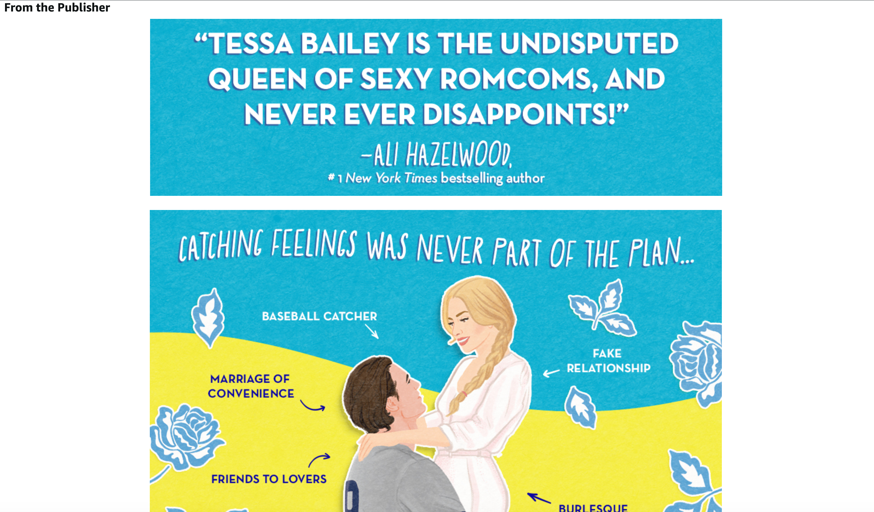
Module 2: The “what’s inside” block. This is where you show readers what they can expect in the book - its tropes, its setting, its emotional promise, characters, etc. Standard Three Images and Text or Standard Four Image & Text Quadrant work best here. The job: turn “this is a romance novel” into “this is a small-town second-chance romance with a grumpy widower and a beekeeper and a haunted carousel and you’re going to love it!”
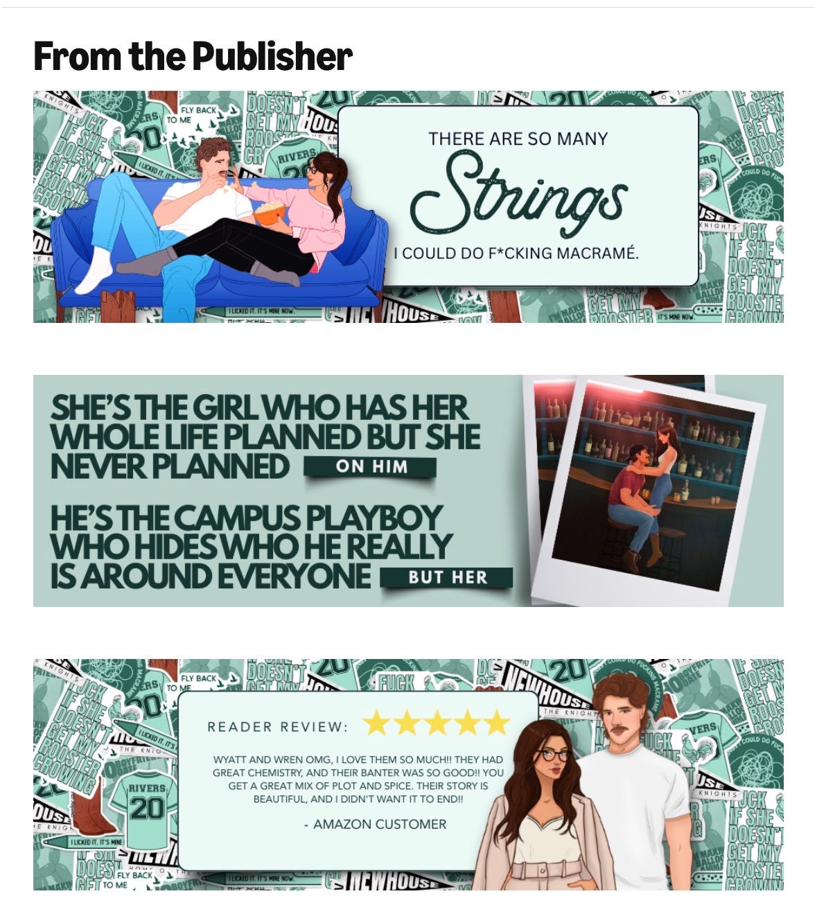
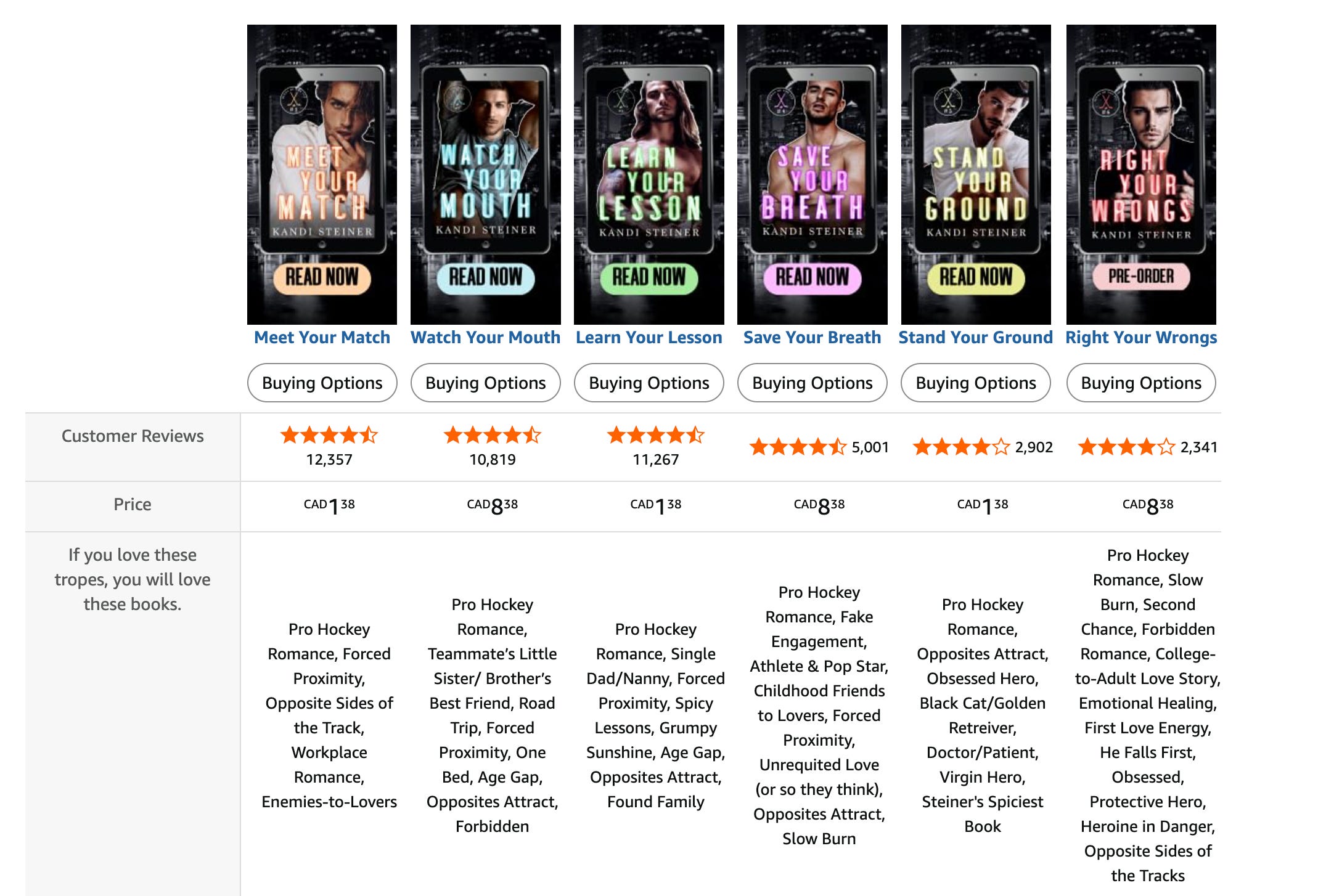
Module 3: Proof or series context. This slot adapts to your book and where you are in your publishing journey. If you have a series, use Standard Comparison Chart to lay out reading order with covers and one-line descriptions for each book. If it’s a standalone, use Single Image & Sidebar to feature a pull quote from a review or blurb. The job: make this book feel like it belongs to something whether that be a body of work or some kind of “proof is in the pudding”.
Module 4: About the author (hey! That’s you!). A short author bio with a photo, and ideally with a personality hook. Use Standard Single Image and Sidebar (the image is 300×300 px). The job: connect the book to a real person whose taste the reader might want to follow into future books.
Four modules. That’s IT - that’s literally all you need. Anything else is a bonus and not something you need to worry about right now. Amazon technically lets you stack up to five modules per project, but in practice four is the sweet spot. Four is long enough to do real work, short enough that readers actually scroll through it, and manageable enough for you to actually create.
how not to get…DENIED
Before you design anything, keep this list in mind because it will save you a lot of frustration down the line. These are the most common rejection triggers, and they’re all avoidable if you know about them up front:
No prices, percent-off claims, or “free bonus content” mentions. Amazon handles pricing dynamically and they don’t want it duplicated in static content. Which I honestly agree with - don’t pigeonhole yourself into having to make any changes to your creative as you change pricing.
No quotes or endorsements from private individuals. This is a SUPER interesting one, but worth noting. You CANNOT quote a Goodreads review4, a Bookstagrammer, a friend, a beta reader, or another non-famous author5. You can quote a maximum of four endorsements, and only from “well-known publications or public figures” (think Publishers Weekly, NYT, a famous-enough-to-be-reasonably-recognizable author), with proper attribution.
No contact info. No URLs, no email, no phone, no QR codes, no social handles, no “follow me on Instagram.” Amazon wants readers staying in their ecosystem, so don’t use this to push them anywhere.
No misleading claims. “The best romance ever written6” will get you rejected. Stick to descriptive language, don’t try to make any unnecessary statements.
No mention of other retailers. Don’t say “available on Apple Books” or “free on Kindle Unlimited” (yeah…that will also get you denied weirdly…Amazon will add this part for you).
No low-resolution images. Amazon recommends 300 DPI and at least 970 pixels wide for most modules. Blurry images get bounced, and, again I can’t blame them - it won’t make anyone want to buy your book if the image looks like a photocopy of a photocopy of a picture taken in 1992. Pro tip if you’re in Canva: when you export your image, slide the resolution to 2x (or even 3x) - you’ll get the crispest image possible.
Most rejections are not punitive, though they may feel that way. Amazon sends you an email explaining what to fix and lets you resubmit so it’s a no harm, no foul situation. But each round adds another week to the review process because you go back to the start, so getting it right the first time matters when it comes to time.
the look of A+ Content matters
A+ Content is the second time a reader meets your book. The first is the cover - this is what gets most people excited and wanting to pay attention. The close second is the A+ Content. And if those two things don’t match - if your cover is moody coastal and your A+ Content is a Canva template with bright pastels - you’ve confused the hell out of your potential audience.
A+ Content has to look like it came from the same hand (or brain) as the cover. Same palette, same fonts (or close cousins), and same emotional temperature. Don’t treat A+ Content as a separate design project - it is the most important continuation of your book brand.
If you don’t have the design skills to do this yourself, this is one of the cheaper things to hire out - a designer who can build your A+ Content in your existing brand will pay itself back fast. There are a LOT of content creators and author services providers that are now offering this as a package or add-on (if you need recommendations, reach out - there are so many I would happily recommend!)
the actual workflow (because I love a good Kanban board)
Hands on keys, let’s get this done together.
Step 1: Gather your existing brand assets. Open the folder where your cover, marketing graphics, and any branded fonts/colors live7. Start from what you already have.
Step 2: Write the copy first, design second. Open a doc and write the text for all four modules before you touch any image software. Banner headline, the three or four “what’s inside” descriptors, the series context or pull quote, and the author bio. Get it written, get it edited, and get it tight. Give it a few passes. Edit it like you’re a ruthless editor out to make this the best A+ content ever. Copy should not be an afterthought.
Step 3: Build the four images at the correct dimensions. Use the module dimensions I listed above. Save at 300 DPI as JPG or PNG. Keep file size under 3 MB per image.
Step 4: Get to your A+ Content Manager. From your KDP dashboard: Marketing → A+ Content Manager → Start creating A+ Content. Name your project, pick your marketplace (start with the US unless you’re more established elsewhere), and then start adding modules.
Step 5: Build, preview, and double-check. Use the preview function like it’s your best friend giving you advice. Check what it looks like on both desktop and mobile, because the layouts behave differently. Double triple quintuple check for typos.
Step 6: Add ASINs and submit. Before you submit, you’ll apply the A+ Content project to the book ASINs you want it to appear on. One project can apply to your hardcover, paperback, AND ebook for the same title so it’s worth doing all three. Then submit for review.
Step 7: Wait a week-ish. Amazon will email you when it’s approved or rejected. If rejected, the email tells you what to fix. Fix it, then resubmit.
Step 8: Note your baseline and watch. Before A+ Content goes live, screenshot your KDP dashboard’s recent sales data. After it’s live, watch for two weeks. You’re looking for incremental lift, not miracles…the bump is usually visible but modest, and it compounds as more cold readers land on your brand-spanking-new sharper-looking page.
where should you invest your time first
A+ Content is more valuable for some books than others, and it’s worth prioritizing if this isn’t your debut.
It matters MOST for:
Backlist titles that still get traffic but have grown stale. A+ Content is one of the cheapest ways to refresh an older book’s conversion rate.
Series books, where the comparison chart module does enormous work helping new readers find the right entry point and existing readers find the next one (whether that’s already released, upcoming, or just announced).
Books in visual-heavy genres like romantasy, romance, fantasy, anything with strong cover-driven discovery and where atmospheric imagery in A+ Content extends the cover’s pull.
Books in KU, because Amazon is your entire marketing universe and every conversion lift is doubly valuable.
It matters LESS for:
Brand-new launches with no Amazon traffic yet. Build it during launch week, but don’t expect it to do much until you have ad spend or organic traffic pointing at the page.
Books in primarily wide-distribution strategies where Amazon represents a smaller share of overall sales. Still worth doing, but maybe lower on the priority list.
Genres where readers convert primarily off the cover and description alone. Some categories of nonfiction and literary fiction, where readers don’t tend to scroll deep enough to see A+ Content.
Build it for the books where it matters most first and work through the rest of your catalog at your own pace.
my homework for you this week
If you do exactly one thing this week: open KDP, navigate to Marketing → A+ Content Manager, and look at it. That’s it. All you have to do is open the door, see what’s in there, and get familiar with what the interface looks like and what it’s asking you for. Get the lay of the land before you drop anchor.
Half the reason authors don’t do A+ Content is that the first step (finding where it lives in KDP) is mildly annoying, maybe a bit overwhelming, and after that the inertia takes over. If you just open the door this week, you’ll do the rest next week, I promise.
Next week you can write the copy. Maybe build the images. The week after that, submit. A month from now your book will look more professional than most comparable titles, and you’ll have spent a few hours of work, total.
And now you’re all valedictorians, graduated with honors, and made it look easy!
GOLD STARS FOR ALL!

xo Ada
Roughly being the operative word here
Incremental dollars, and your time still counts but you get the picture
These are Amazon’s internal SKU numbers…how they track your book. Separate from your ISBN, but tied to it…retail is so confusing, y’all.
But they’ll let you quote an Amazon review once the book’s out so…do with that what you will
THIS IS AMAZON’S RULE NOT MINE!! FAMOUS IS SUBJECTIVE!
This reminds me of when I worked in telecommunications and we would make comparative claims like “best” and have to argue with our legal team that best is subjective and we can say it because maybe we are the best at SOMETHING and we don’t need definitive proof and what is language, anyway, right? Ahhhh…fun times.
If you don’t have a folder, make one first. No seriously go now.